PEACEMAKING CENTER, WELCOME GRAPHICS
I was contacted to help design signage for the entry door. However, upon meeting at the site it became clear that the desired entry door was not a primary focal point.
Building on a traditional Native American approach to justice, the Center’s peacemaking programs focus on healing and community restoration rather than punishment.
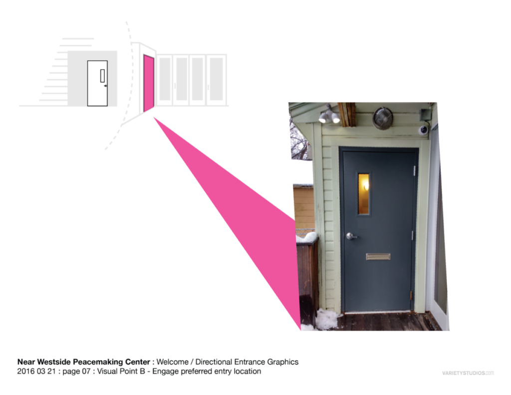
During summer and especially the cold winters of Syracuse the entire space would struggle with temperature control if people came and went through the glass doors. For this and other various reasons, the organization wanted people to enter through the smaller less visible side door.
As this is a place of healing and potentially high tension issues, new visitors to the space maybe in a sensitive mental state, if upon arrival people in conflict were immediately told they are entering the building incorrectly that did not seem like a helpful touch point in the user journey. We determined the signage needed to be as clear and welcoming as possible.
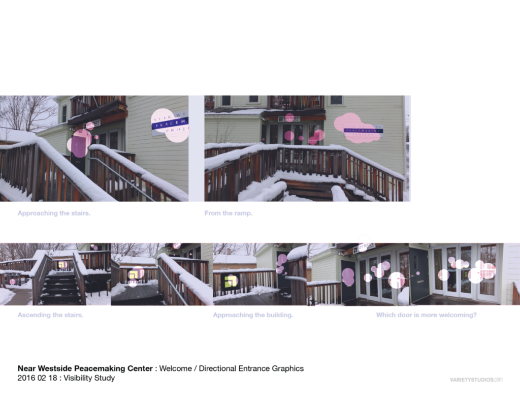
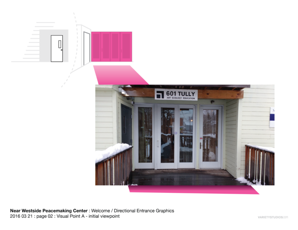
The desired entry door was not the obvious point of entry, beyond its gray metal appearance, the main bay of sliding glass doors were far more naturally welcoming especially when people can visually engage with the people inside, and thus it was decided the intervention should begin at that point, rather than merely add an ‘Enter Here’ sign to the side door.
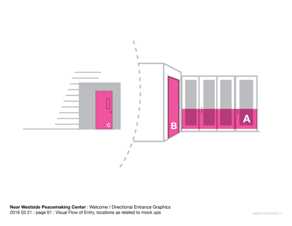
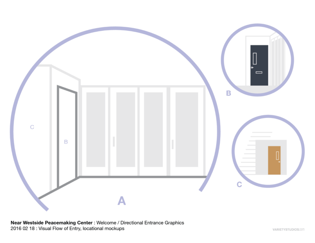
We wanted to provide gentle guidance to the appropriate door, rather than being too harsh, simple or otherwise insensitively utilitarian sterile with the directives.
Instead we thought it would be best to engage the obvious visual points with a welcoming message, that subtly guides the visitor toward the preferred entry point.
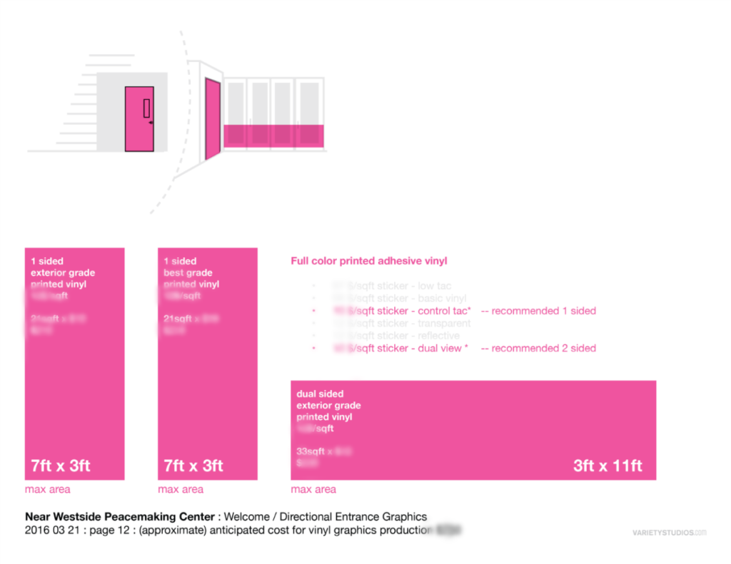
Among other considerations, there was not much budget available for this project, so we sought to use efficient design, affordable materials in the ‘Welcome Graphics’.
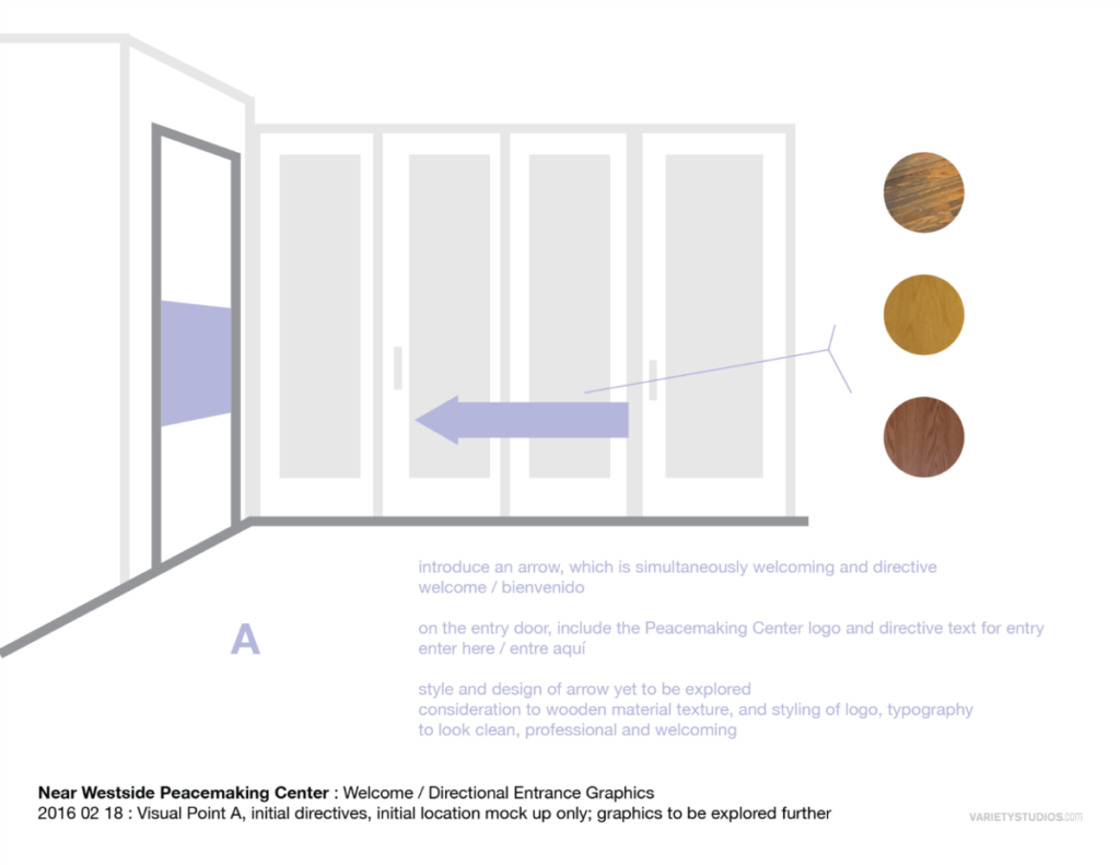
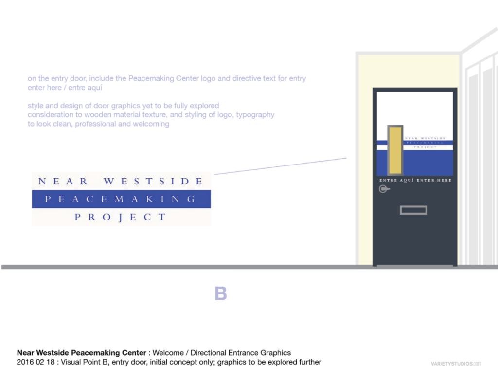
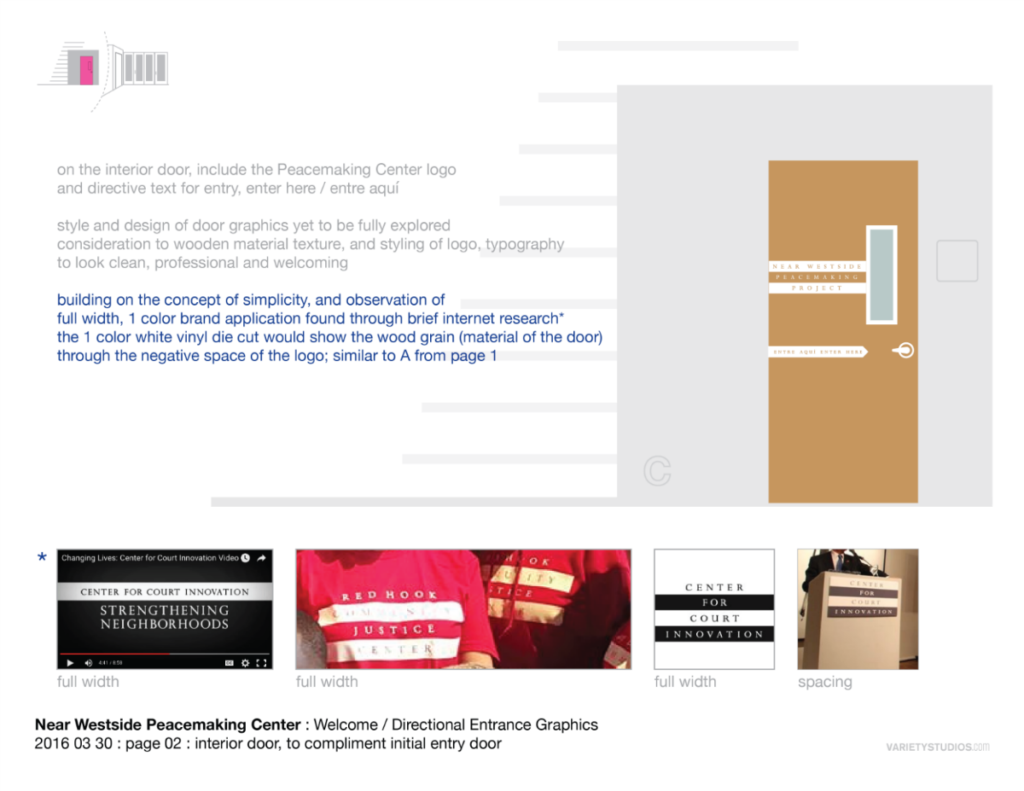
Careful attention to the Center for Court Innovation’s brand guidelines was required, along with the intention to complement the patterns, textures, and warmth of the wood featured in the recently renovated interior community space.
The primary emphasis was to make the message clear, while still being welcoming and preserving the visibility out from within the space, allowing good sun light, keeping a clean look to the frontage and avoiding introducing visual clutter with numerous small signs.


This was a wonderfully nuanced small project which followed a considerate design process!